How to Use Posters to Drive Foot Traffic
Design tips that turn walls into customer magnets.
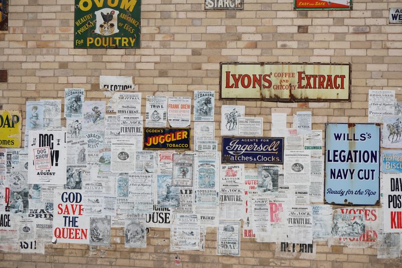
A great poster does one thing really well: it stops someone mid-step and makes them read. In a world of digital saturation, a well-designed physical poster in the right location can be devastatingly effective.
The hierarchy rule. Every poster needs a clear primary message. The headline should be readable from at least three metres away. Everything else - the detail, the logo, the call to action - supports that headline. Don't make it do too many jobs at once.
Location before design. Before you design a poster, know exactly where it's going. A window poster gets different light and viewing angles to a noticeboard poster. A weatherproof outdoor site needs different materials to an indoor display.
Contrast wins. High contrast between background and text is the single most effective thing you can do for readability. Dark text on light, or light on dark. Avoid mid-tone combinations - they look muddy in print.
Include a reason to act now. The most effective posters create urgency - a date, a limited offer, a specific call to action. 'Open now' is weaker than 'Open today until 9pm'. Give people a reason to stop scrolling, even if the scroll is just their legs.
Pair your poster campaign with a matching digital presence - same visuals, same message - and you create a reinforcing loop that significantly boosts recall.
Ready to print something great?
From business cards to banners - we make it easy to look the part.
Shop Products